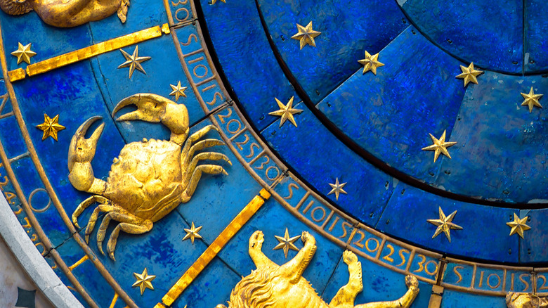
Cancer the Crab is known as one of the most sensitive signs of the zodiac. While all of the water signs tend to be on the emotional side, Cancer is also ruled by the moon, a celestial body that appears to be in a constant state of flux.
As Cancer’s feelings can seem to wax and wane with the frequency of their ruling orb, it’s important for the Crab to be surrounded by soft, soothing colors that make them feel like they’re in a peaceful, harmonious environment. Cancers were born in the summertime (all of the ones residing north of the equator, that is), and their colors reflect this influence. Cancer’s best shades tend to be more soft and muted that the more vibrant colors found in autumn or the starkly contrasting ones of winter. Of course, being a Cancer does not mean that you’re obligated to limit yourself to the colors in your zodiac sign’s palette, but you might want to at least consider using these colors for accent pieces in order to look and feel your best.
Cancer colors are inspired by their natural element

Crabs are not only a water sign, but are also associated with the body of water favored by their symbolic animal: the ocean, home to the vast majority of crab species (via Northern Michigan University). When you think of a day at the beach, what colors come to mind? There’s the off-white color of the sand, the soft blue sky, maybe some brown driftwood, and green seaweed — and of course there’s the ocean itself, with its waves ranging from tropical blue to cold Atlantic gray. This color palette is as lovely as it is restful, and all of these colors are sure to appeal to any Cancer.
While Cancers may feel at home at the beach, they are nonetheless moon children, and their ruling planet (well, technically a satellite) also exhibits its own range of colors. According to Love to Know, all of the moon’s colors from palest yellow to vibrant harvest orange to dramatic blood red can be considered part of the Cancer color palette.
These colors are particularly lucky for Cancers

According to Now Let’s Get Going, the one color Cancers should wear when they need to dress for success is a bright, sunny (or perhaps moony) yellow, as this shade can help to perk up the sometimes gloomy crab. Love to Know, however, declares that blue is the power color for Cancers. They do say that any blue will do, though, so you could go for Caribbean, cerulean, navy … whatever floats your ocean-going boat, so to speak.
Not only blue, but silver is also considered to be a lucky color for Cancers. This is probably on account of, as the old song lyrics put it (via Lyrics), “by the light of the silvery moon.” Silver is said to be especially powerful when it appears alongside blue. A blue backdrop only serves to accentuate silver’s shine, a look that can serve as a good luck beacon to lead all kinds of good stuff your way.
How to add Cancer colors to your wardrobe

There are a few shades that Now Let’s Get Going says Cancers should try to steer clear of. The first one, burgundy, isn’t a staple in most people’s wardrobe, except perhaps around Thanksgiving when they may feel compelled to match the season’s cranberry sauce. The second one, black, is a different story. It’s the one color that’s nearly impossible for any sign to avoid. No worries, Cancer! Go ahead and hang on to those black pants and skirts and shoes, but maybe pair them with a top in one of your signature shades. If you’re reluctant to part with that sexy little black dress, though, consider adding an eye-catching accent in your sign’s colors, like maybe some dramatic turquoise jewelry in a silver setting or a pretty sea-green and white patterned scarf.
When you’re choosing wardrobe pieces in your Cancer palette, don’t forget texture, as well. Cancer is drawn to light, breezy pieces that flow and ripple like waves on the water.
You can also use a Cancer color palette to decorate your home

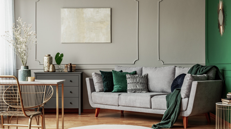
Cancer is the most home-loving of the signs, so it’s important that Cancers try to make their space a refuge of peace and beauty. The Cancer color palette can be put to good use here as well. Even if you can’t live at the beach year-round (or ever! — “affordable” beachfront property is the ultimate oxymoron), you can decorate your home to make it look as if the ocean is right outside your window. Think sand-colored or soft gray walls with blue or green trim, white wicker furniture, and lots of comfy blue and green throw pillows.
Love to Know favors the three-color palette approach to home decorating, although they suggest that such color combos work well for wardrobe building, too. In order to make use of this technique, you would choose three complementary colors such as deep blue, medium gray, and glass green (not grass, but glass, as in a bottle that’s been drifting on the ocean bearing a message from distant shores). If you prefer, you could swap out the green for yellow or silver, or the gray for an off-white, and of course you have the whole spectrum of blues with which to work. You simply mix and match these colors for all the staple elements of your décor, such as rugs, walls, and upholstery.
Source: Read Full Article
